Digitalising Financial Reporting
Challenge & Background
Reporting the performance and market movements of an investor’s portfolio in the form of an annual or quarterly report is standard practice. It’s also required by the Markets in Financial Instruments Directive (MiFID). The digitalisation of this process is something that a number of our clients have requested and also presents a unique selling point for our company.
My Role
I was responsible for the research and testing phases of this project. I also worked closely with our lead designer in the design phase and handover.
1. Planning & Research
Our Research Goals
We conducted six semi-structured interviews with users from our target group. During these interviews, we asked them to describe the process of creating a report and how it is ultimately used.
Where possible, we conducted observational field studies (contextual inquiry) with the same target group to better understand the creation of a financial report in real-time.
The Big Questions
We had three crucial questions that we needed answers to:
- How do users provide end of year financial information to their investors?
- Which medium do our users prefer to communicate with their investors through?
- What feedback have our users received from their investors regarding financial reporting?
Method
Primary Research
We conducted six semi-structured interviews with users from our target group. During these interviews, we asked them to describe the process of creating a report and how it is ultimately used.
Where possible, we conducted observational field studies (contextual inquiry) with the same target group to better understand the creation of a financial report in real-time.
Desk Research
We also summarised the latest information on regulatory requirements surrounding financial reporting as outlined by the Markets in Financial Instruments Directive (MiFID).
Sample interview questions
“If you were to start building a financial report completely from scratch, what do you think would be the most important information to include?”
“Imagine you were building a financial report 10 years from now, what technology do you think you would use? Do you think the format would be different?”
“On a scale of 1 to 10, how important is the financial report to your business? Why?“
A full overview of questions, participants and our approach can be found in the Research Project Plan
2. Thematic Analysis
Making sense of our Data
With our user interviews completed, we started the colossal task of transcribing and codifying our data. From this information, we identified 8 themes that would form the basis of our design thinking.
Alongside our user interviews, we analysed the relevant legal requirements surrounding financial reporting and also procured 2 of our client’s existing reports.
Coding & tagging
We identified our data by assigning one or multiple tags to each data entity. This allowed us to identify common patterns and themes within our dataset.
Themes
1. Different types of users
We identified two unique user types. In this document, we will refer to them as High-Net-Worth Client Users (HNCU) and Low-Net-Worth Client Users (LNCU).
2. Opportunities and roadblocks
HNCUs generally see financial reporting as an opportunity. Whereas LNCUs generally view it as a cumbersome regulatory requirement.
3. Customisation and standardisation
HNCUs wish to have full customisation of their reports. However, LNCUs would generally prefer a standard format that ticks all regulatory boxes. Both will occasionally include a cover letter.
4. Storytelling
HNCUs often visit investors in their homes or other social settings (e.g. a golf course) and use the report to support ‘storytelling’ or build a narrative on future opportunities. This is their chance to differentiate themselves from their competitors.
5. Basic digital tools
Most HNC and LNC users have a digital, internal tool for report generation. Others simply use Excel to serve this function.
6. Paper reports are still relevant
All HNC and LNC users provide the financial report as a physical medium and either hand it over to investors in person or send it via post. This is for legal reasons. From time to time, users will manually re-print reports to be sent. However, due to the relaxation of rules, a digital-only solution may be possible in February 2022.
7. Reporting periods
All HNC and LNC users would like the ability to send quarterly, annual and ad-hoc reports.
8. Establishing brand
Both HNC and LNC users want to at least be able to edit the logo and colour scheme of their financial reports. In the case of HNCUs, the ability to add additional insights (e.g. portfolio deep dive or specific data visualisation) to financial reports is important.
Want to read the full Analysis process?
3. Design & Implementation
Enter Report Builder
We quickly realised that our users sought a solution that would be flexible enough to allow customisation but should always check all the necessary compliance checkboxes. With that in mind, we took the approach of allowing our users to build their own pages to suit their individual needs. We looked to many other ‘builder’ style solutions, for example, website builders like Wix and Webflow.

For our first iteration, each ‘page’ was split into 4 sections. The user could populate each section with a component of their choosing. We chose to limit the page to 4 sections to ensure the content of the page is legible once it is printed in the final report.
We have pre-defined a series of components that can be customised to our user’s needs. Each component can be added to a page and resized as needed.

We provided our users with a basic ‘drag and drop’ function for our users to intuitively add components to each page. Once added, each component has additional options, for example, resizing and editing text.
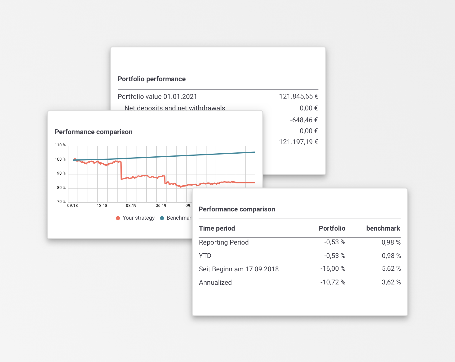
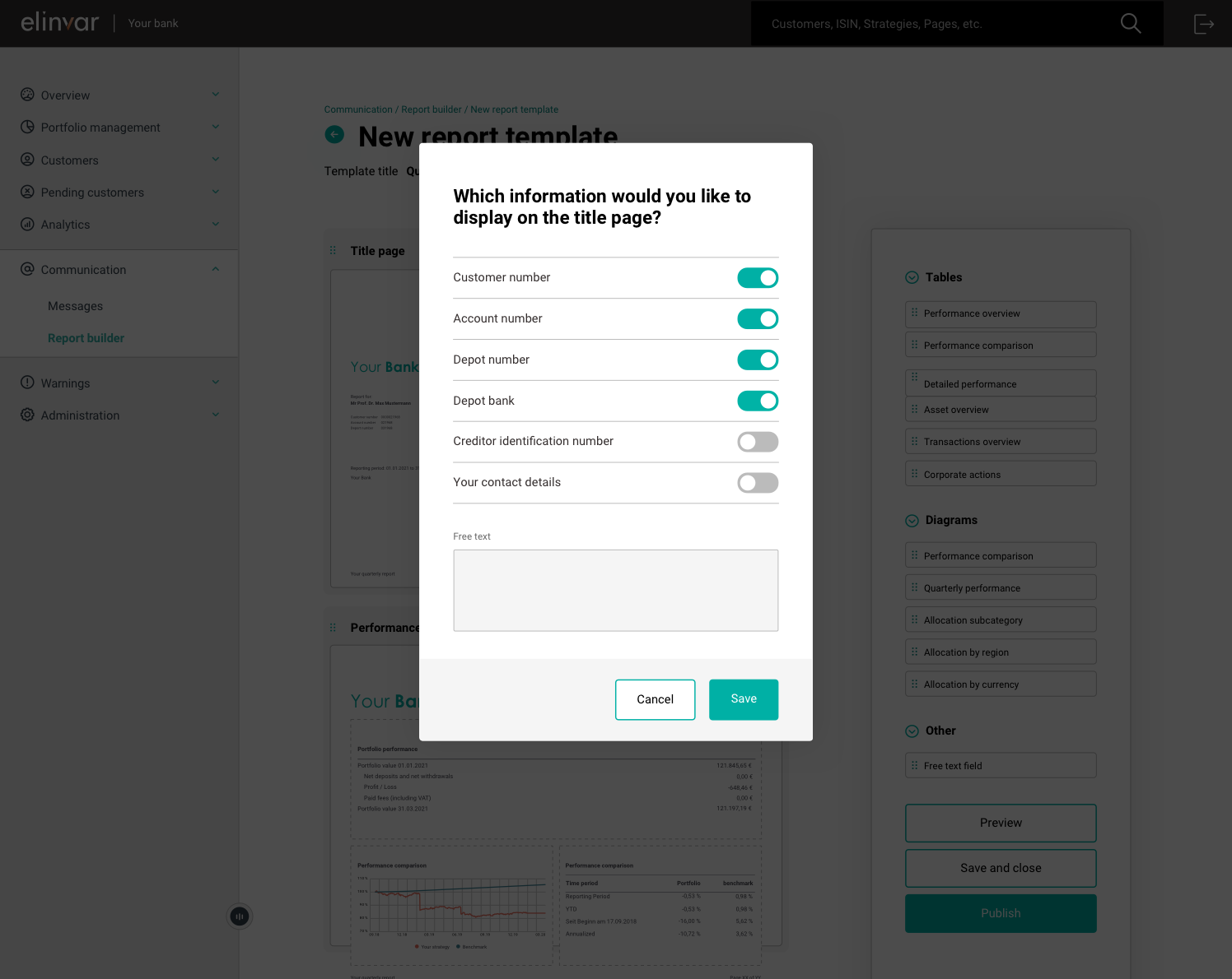
Each component has a different level of customisation. For example, in the ‘front page component’, a user can choose whether to include the customer number, account number or contact details for the bank.
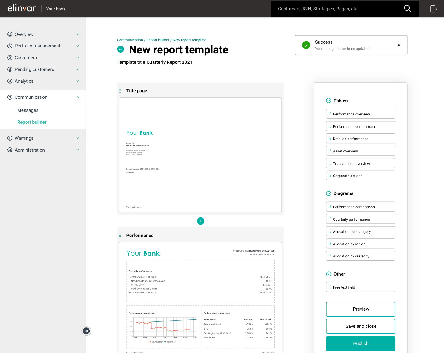
Once the user is happy with their customised layout, they can preview, save or publish the report.
4. User Testing
Our testing process
Having completed the first iteration of our ‘Report Builder,’ we completed a series of usability tests with a number of our users. Each testing session was composed of three distinct parts:
- Pre-test Questionnaire*
The pre-test asks some basic demographic questions but also helps to understand the existing approach to generating reports. In addition, it helps us to clarify the user’s prior knowledge regarding report building and their technical abilities. - Usability Test
Users were presented with a high-res mock-up and were asked to complete a series of tasks. The workflow followed a largely linear process of asking a user to create, edit, preview and eventually publish a report for their investors. - Post-test Questionnaire*
In the post-test, we allowed our testers the opportunity to give their general feedback and impression of the report builder.
*Samples of the pre and post-test questionnaire are available in the User Testing Plan.
Usability Test
The participants were asked to complete 10 tasks.
Each tester was advised that the results will be anonymised. They were also told that there is no right or wrong answer and to think aloud as they complete the tasks.
The tasks revolve around:
- Navigating to the report builder page in the portal
- Setting up a series of new pages
- Adding widgets to a page
- Editing a widget
- Updating the metadata of the report
- Previewing a report
- Editing an existing report
- publishing a report
Testing Objectives
There were two main questions we wanted to answer with our testing session.
- Can the users figure out how to create a new report from scratch, including adding, editing and deleting components?
- Can the generated reports fulfil the expressed user needs from a branding, compliance and story-telling perspective?
Live testing video sample

A full overview of our testing approach can be found here
5. Further iterations & Next Steps
Continuous Improvement
Setting up a new page
Users found the task “Setup a new page with the title ‘Performance’” difficult.
Users instinctively tried to create a new page using the PLUS button rather than using the empty page that is already available.
This may have been an issue with the wording of the question. Alternatively, it may have simply been confusing for users to see an empty page.
Once users had renamed the page, adding components was not overly difficult.


Adding components
The grouping of widgets (e.g. Tables/diagrams) confused more than one user.
When users wished to add a performance comparison table, for example, many tried adding a performance comparison diagram.
Encouragingly, however, all users instinctively tried to ‘drag and drop’ despite the prototyping software not supporting this interaction.
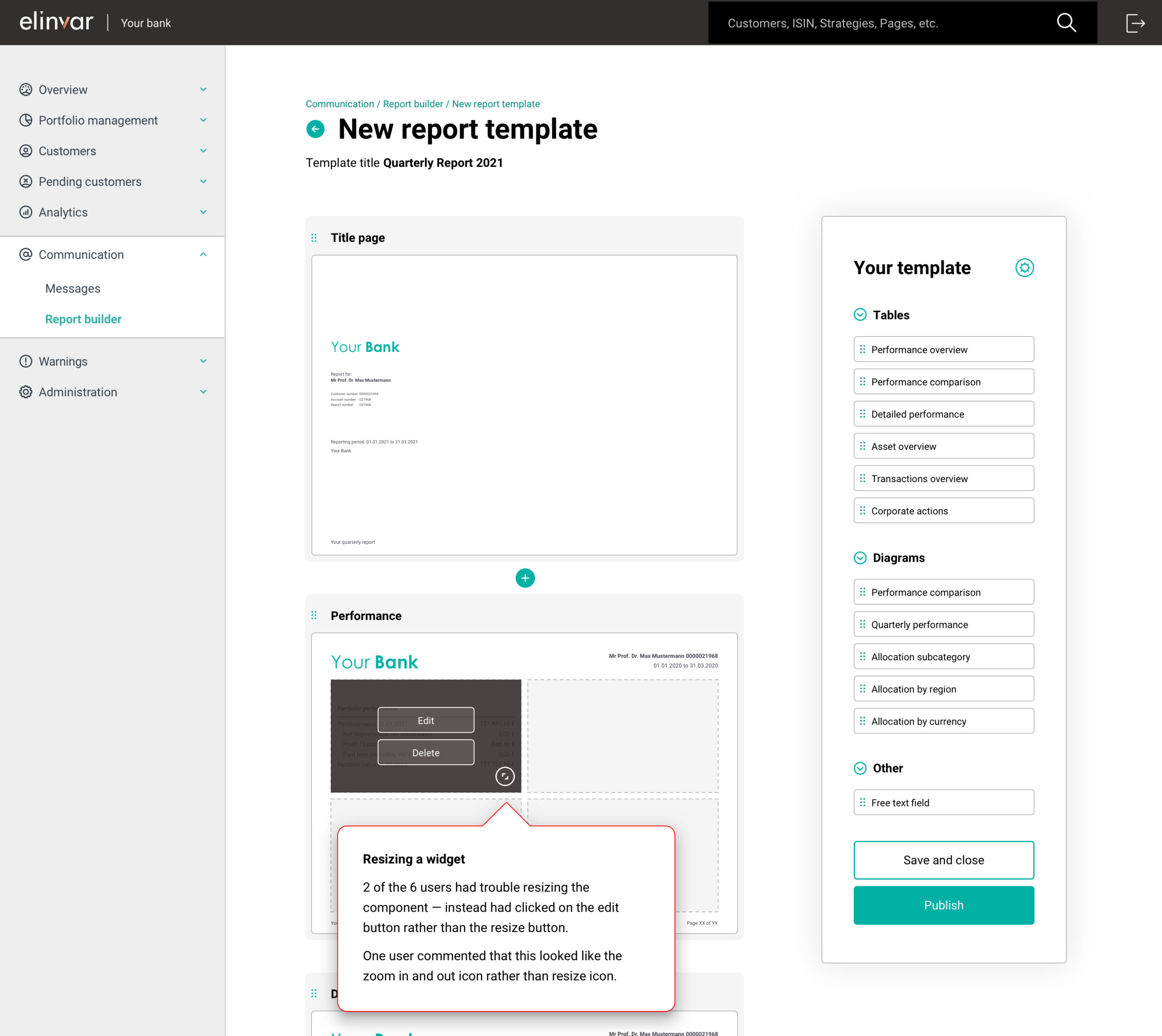
Resizing a widget
2 of the 6 users had trouble resizing the component. These users clicked on the edit button rather than the resize button.
One user commented that this looked like the zoom in and out icon rather than resize icon.
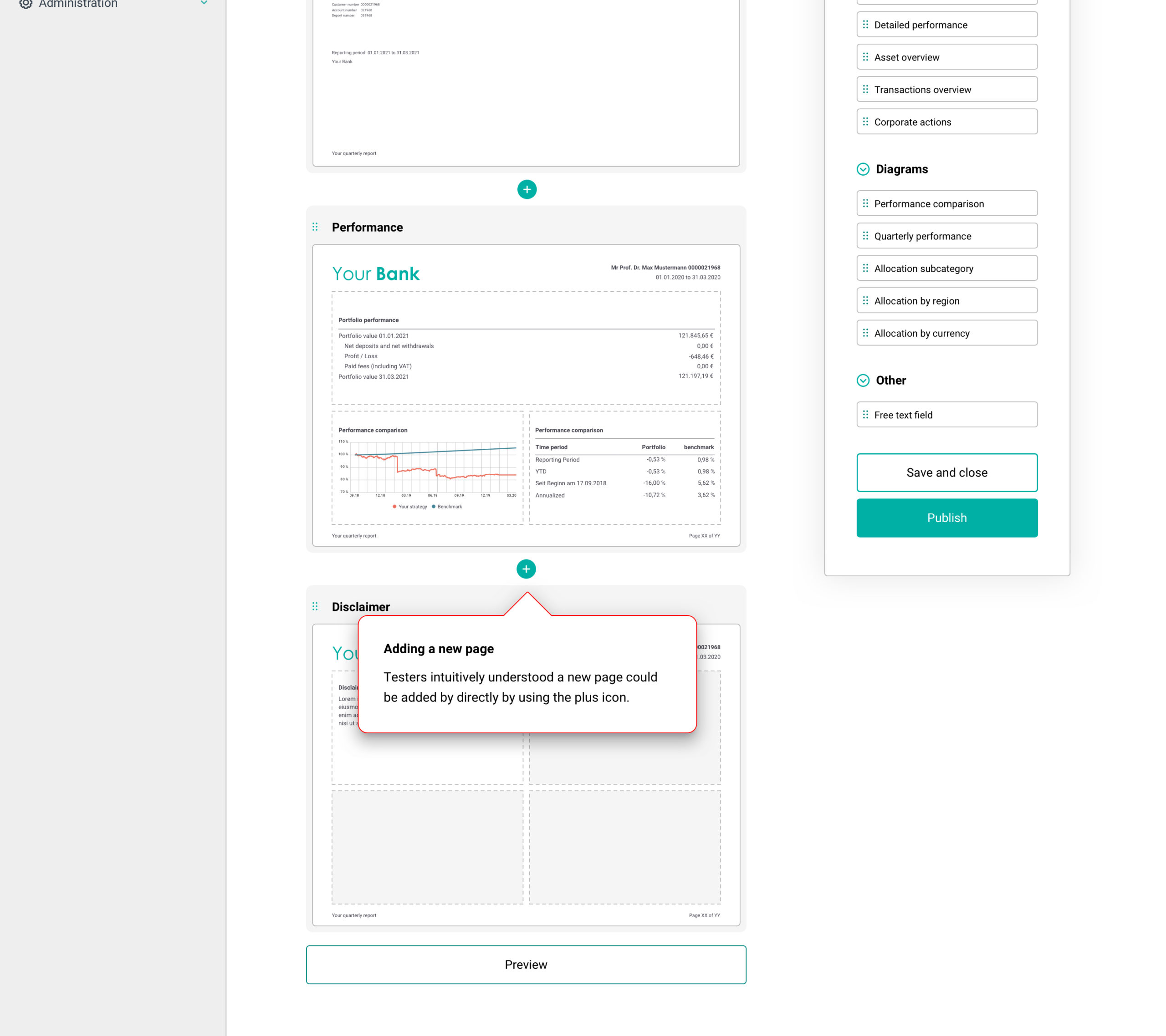
Adding a new page
Testers intuitively understood a new page could be added directly by using the plus icon.
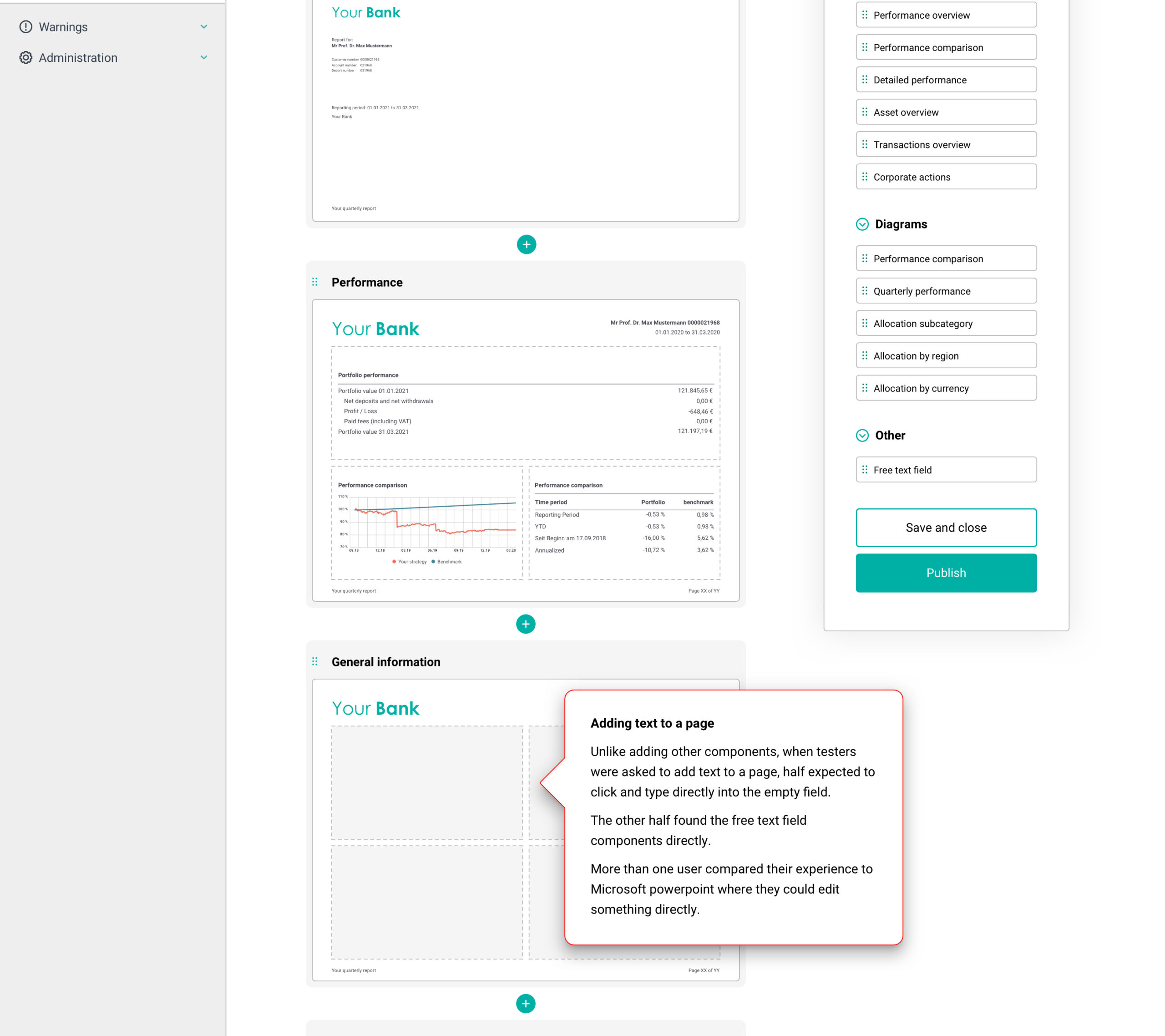
Adding text to a page
Unlike adding other components, when testers were asked to add text to a page, half of them expected to click and type directly into the empty field.
The other half found the free text field components directly.
More than one user compared their experience to Microsoft PowerPoint where they could edit something directly.
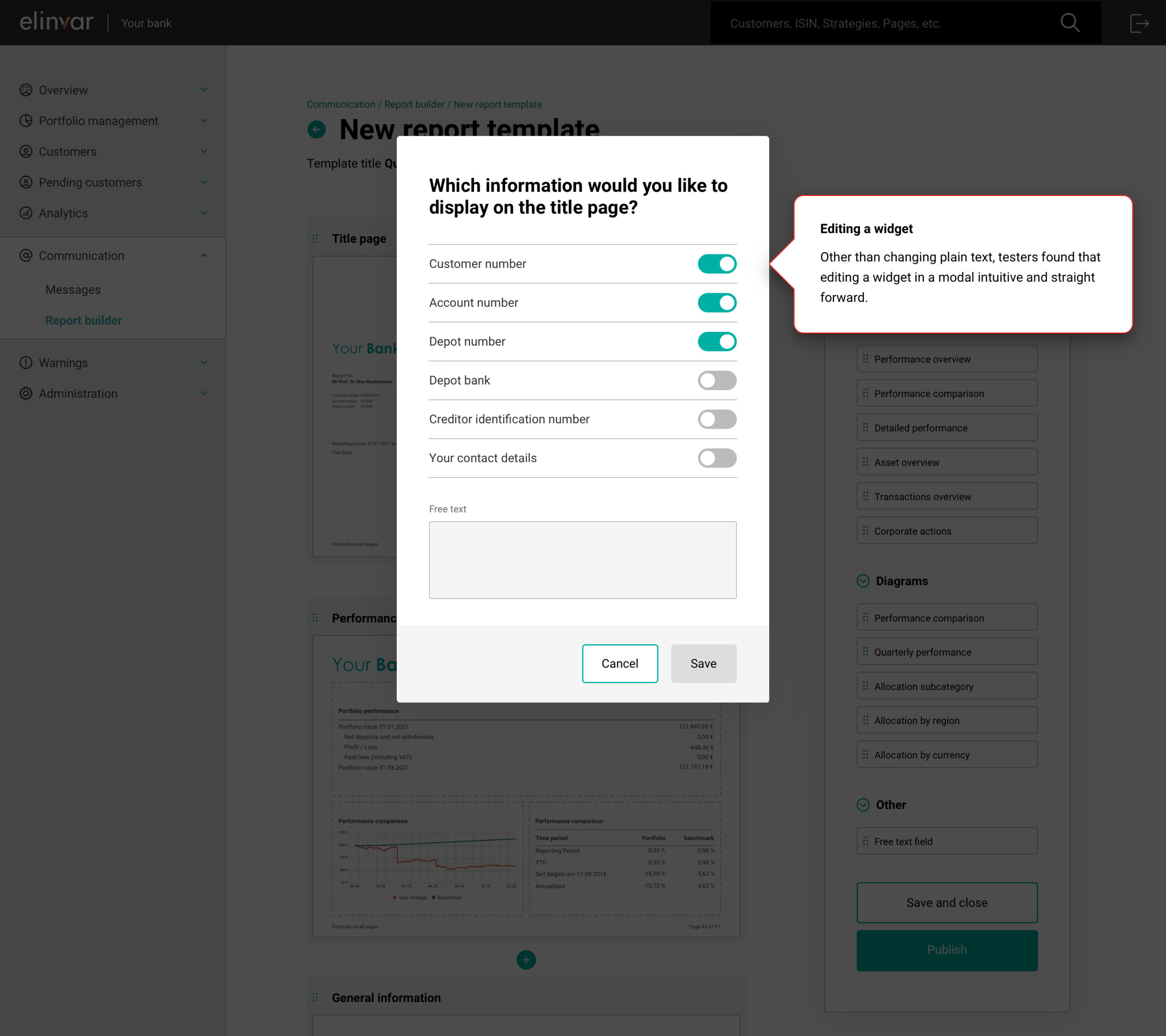
Editing a widget
Other than changing plain text, testers found that editing a widget in a modal is intuitive and straightforward.
So there you have it! I hope you’ve enjoyed seeing our process for this project. If you have any questions regarding this or any of my work, please do not hesitate to reach out!